This guide details the National Park Trust brand story and the proper use of our logo, colors, fonts, and more. Please consult these guidelines when creating or using photography, social posts, blogs, or graphics in partnership with the National Park Trust.
OUR BRAND STORY
Since 1983, we have acquired the missing pieces of our national parks, the privately owned land located within and adjacent to our national parks’ boundaries. We also have brought thousands of kids from under-served communities to our parks; they are our future caretakers of these priceless resources. In 2023, the Park Trust us celebrating our 40th anniversary. Read more about our history and explore our interactive timeline.
Our Mission
We preserve parks today and create park stewards for tomorrow.
Our Vision
Everyone experiences the endless possibilities of our nation’s parks.
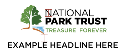
OUR LOGO
Since our inception, a tree has been the centerpiece of our logo and the core of our brand identity. We felt that keeping the tree but giving it a meaningful spin would be a great way to honor our past while moving forward into a more expansive future.
Our new logo boasts bright, cheerful colors, with a newly updated tree at its center. Each element has been carefully designed to tell the story of who we are and where we are going as an organization. To learn more about these elements and their story, visit https://parktrust.org/newlogo.
When possible, our logo should be used in full color for all digital and print applications. If full color is impossible, an all-white or monochromatic version may be used. Do not use a full-black logo.
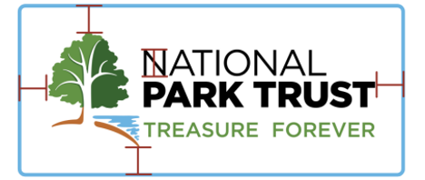
Horizontal Logo:
Vertical Logo:
* Use these logo lockups as the preferred option for brand and marketing applications. Please exercise discretion regarding whether the horizontal or vertical option is best for your needs.
Clear Space:
To ensure the Park Trust logo has consistent, optimal legibility and prominence, an area of clear space should be maintained around the logo. This distance should, ideally, be equal to or greater than the N’s height in NATIONAL at each of the furthest reaches. See below for an examples:
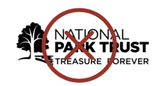
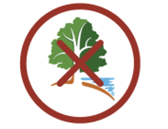
Logo Misuse:
To maintain brand consistency, the Park Trust logo may not be re-stacked, stretched, transformed, or used with any other color palette.
The logo may not be presented in FULL BLACK
The logo should always have both elements: GRAPHIC and WORDS. Do not use just our tree or just our name/tagline.
Logo Files:
Please click here to access all files for logos that are available for download.
Logo Use Notes:
The Park Trust’s visual aesthetic is vibrant but clean. It uses plenty of negative space and keeps backgrounds and borders simple.
Photos used surrounding our work should always focus on people engaging in and having fun in public lands and waters. To showcase our work and the positive impact we have on our community, the Park Trust uses high-quality, vibrant, large photos of landscapes and people in parks for our materials. Photos featuring people of all ages, races, abilities, and walks of life engaged in different kinds of positive park usage are encouraged.
OUR COLORS
These colors should be used for all logo applications and as the dominant colors in all marketing materials. Dark Green and Light Green should always be given top billing in any print or digital assets as these are our primary colors.
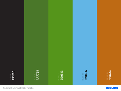
Hex, RGB, CMYK, and Pantone
DARK GREEN:
ABCDEFGHIJKLMNOPQRSTUVWXYZ
Hex: 4A7729
RGB: 74, 119, 41
CMYK: C 71 M 4 Y 100 K 45
Pantone 364
LIGHT GREEN:
ABCDEFGHIJKLMNOPQRSTUVWXYZ
Hex: 55951B
RGB: 85, 149, 27
CMYK: C 63 M 0 Y 97 K 20
Pantone 2277
BLUE:
ABCDEFGHIJKLMNOPQRSTUVWXYZ
Hex: 62B5E5
RGB: 98, 181, 229
CMYK: C 60 M 9 Y 0 K 0
Pantone 2915
BROWN:
ABCDEFGHIJKLMNOPQRSTUVWXYZ
Hex: BE6A14
RGB: 190, 106, 20
CMYK: C 5 M 64 Y 100 K 17
Pantone 153
OUR FONTS
When using our logo, please use YOUR font to accurately convey our partnership with your audience. If you are in need of our fonts, the following are the fonts used for all National Park Trust materials and channels.
Logo Font: GOTHAM is the font used within our logo. We do not use this font for anything other than our logo. When using GOTHAM, we use all uppercase letters to have consistency in size and readability.

Primary Font: RUBIK is the font used for all marketing materials for the Park Trust. This is also the font used on our website. Rubik is a basic, cross-platform font and will work on any email platform regardless of age or device. To download Rubik, please click here.
*In social graphics, be sure to use ALL CAPS for titles for maximum readability.
OUR VOICE AND TONE
National Park Trust’s tone of voice is informative, professional, and upbeat across all platforms. We want to be professional and knowledgeable, but approachable. While each of our communication channels, programs, and events may have a slightly different feel depending on the audience, our overall tone and voice should fit these guidelines.
Rules of Thumb:
- Do not use the acronym “NPT”. We do not use NPT as a shortened form of our name. Our only approved shortened name is “The Park Trust,” only after “National Park Trust” has preceded it in writing. We allow The Park Trust because our work does not only focus on national parks but all public lands and waters.
- If promoting your partnership with the ParkPassport App, please keep in mind ParkPassport is one word.
https://wwwOmit “https://www.” when referring to a website in copy: Visit parktrust.org (note all lower case) for more information.- Be concise but clear. Be sure to make your language simple and easy to understand!
THANK YOU!
Questions or feedback? Send us an email!