New Logo. Same Great Work.
National Park Trust is evolving to meet the needs of our nation’s parks and our youth. In 2022, we are turning over a new leaf with a new logo.
At the National Park Trust, our mission is to “preserve parks today and create park stewards for tomorrow,” and we have decided to update our logo to better reflect who we are and our work. Since our inception, a tree has been the centerpiece of our logo and core to our brand identity. We felt that keeping the tree but giving it a meaningful spin would be a great way to honor our past while moving forward into a more expansive future.
Overall, we see the bright and cheerful colors as being representative of our youth programming and excitement for the parks we get to work with. Each element of our new logo has been carefully designed to tell the story of who we are and where we are going as an organization.
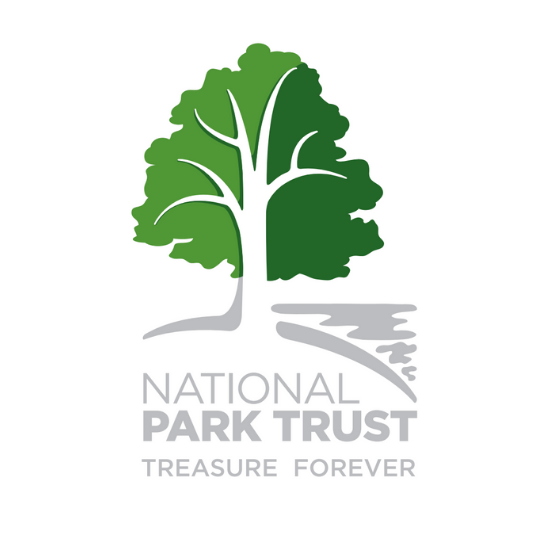
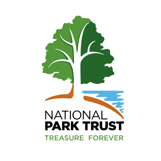
The Tree: The largest and most crucial element of the new logo is our tree. The tree shows strength, growth, and stability, all elements of our national parks, and what National Park Trust’s foundation is built on. The tree is designed to be a mixture of different species found in the parks and uses two different shades of green to represent old and new growth – bridging the past and the future. The branches are defined, smooth, and curved to flow from all parts to come together symbolically as one. The tree also represents strong roots, inclusiveness, and the importance of being welcoming, valuing and respecting our differences, and connecting with people from a broad range of communities.
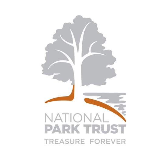
The Land: As the literal foundation for the tree, the land element is represented with a rounded curve. The curve suggests land that isn’t only flat but includes the rolling hills throughout our nation. The color is a deep, rich, and warm brown, just as the soil needs to be to support the world that rests above and grows within.
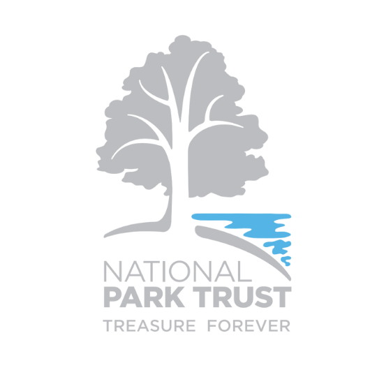
The Water: Oceans, lakes, and rivers are the lifeblood of our environment. That element is represented with a bright blue that engages with the tree and land elements, just as it does in our parks. The shape is fluid and was drawn from highlights of light reflecting onto water. Therefore, creating a sun and moon representation without cluttering the logo with too many elements.
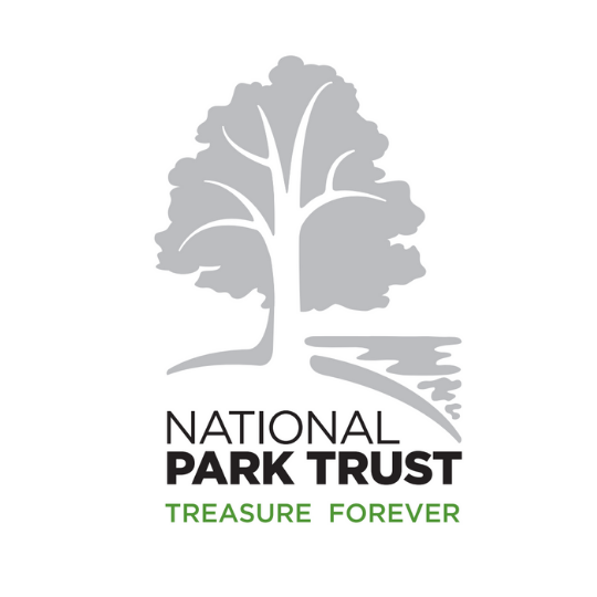
The Wordmark: “National Park Trust” was intentionally kept in the same font and a similar format as the previous logo. “National” was made thinner to emphasize “Park Trust”, our main focus. The name is reproduced black for easy readability; however, the tagline, “Treasure Forever,” was accentuated in the fresh green to separate it out from our name and to catch the viewer’s eye.
The Logo: All these elements (the tree, land, water, and wordmark) come together to create a deeper meaning for the NPT brand. You’ll see our new logo across our channels – but we’re still the same National Park Trust, doing the same great work. We hope you’ll agree that this new logo breathes new life into the work we do and is a meaningful step to tell the story of the Park Trust and its continued evolution, growth, and impact.
In addition to the updated logo – our lovable mascot, Buddy Bison, also got a new look. Click here to learn more about our mascot and our Buddy Bison programs.